A tastefully palleted political map of the world in a sleek Robinson projection with a cheeky twist- a reminder that there is no “up” on a big ball spinning in space. Who is “up” and who is “down”? Well, everyone and no one. Reading a map like this can often feel like looking at a world map for the first time. Perfect for blowing the minds of you and your friends while also being a bit more put together than the Gall-Peters projection that goes viral every so often for being edgy and countercultural without being, you know, good. Has country and city labels.
24”x36”
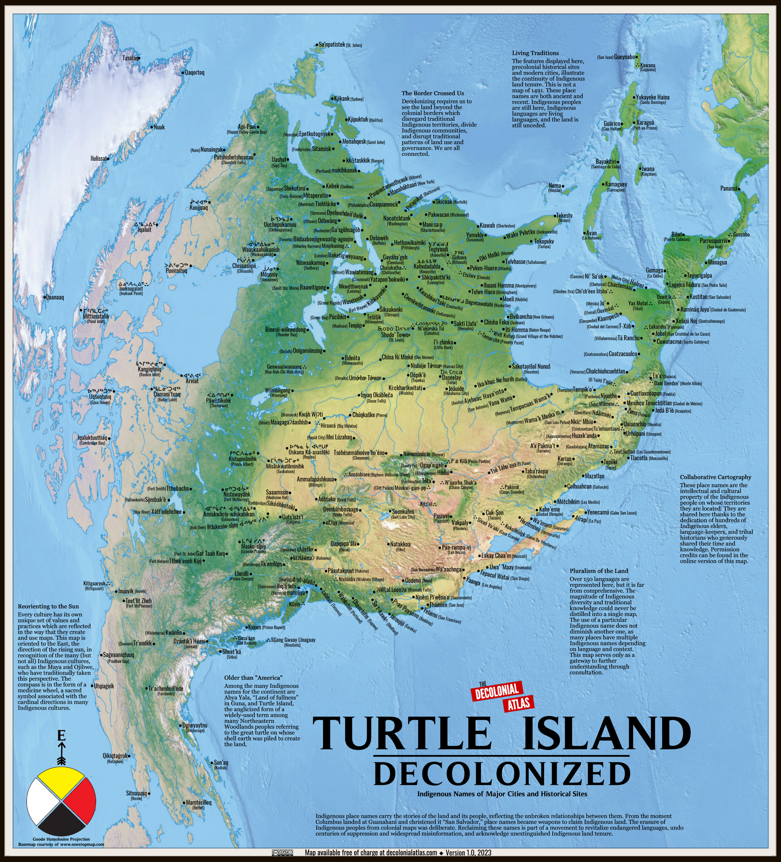
Every map instantly creates two types of people: those who make the maps and those that are mapped. Every map represents a world view and a perspective and I’m so delighted to offer this piece that shows the world in a way unfamiliar to most Americans with place names in their Indigenous toponyms. It is a beautiful and thought provoking piece priced to be accessible to educators.
The Decolonial Atlas produces this map and their logo features prominently. The price of this print is reflective of the production cost only and we offer this design for printing because it’s a beautiful idea that should be more common than it is.
19”x21”

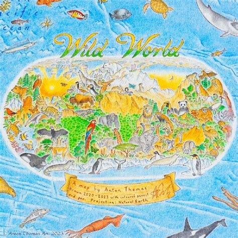
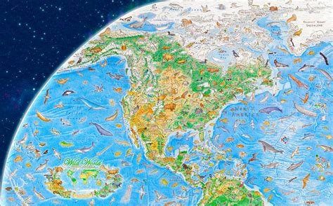
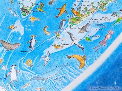

Maps are a labor of love and sometimes they take years of research and drawing by hand to create. There are few better examples of the craft and dedication of modern cartography than Anton Thomas' epic Wild World which features 1,642 hand drawn and exquisitely detailed animals representing the incredible biodiversity that we share our planet with.
See his profile in The New York Times here.
Small: 30 x 16”
Medium: 39 × 21”
Large: 50 x 27"


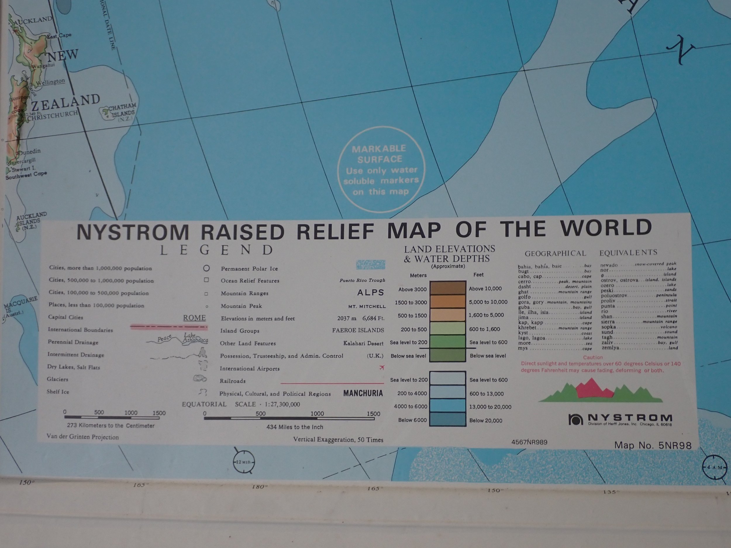
This immense map has a raised, touchable surface that is a delight to at least two senses. The Himalayas come up about 3/4” and the washable polystyrene is actually marker-safe. Comes in a single piece frame ready to hang.
It appears to be from about 1995, so throw on some Blues Traveler or your favorite Bill Clinton saxophone casette tape and explore the world from a time when The Simpsons was still fresh.

I usually think of geologists as people who wear clashing plaid and cellphone holsters on their belts. So how is it that geologists consistently have the most beautiful graphic design of any field of science?
Massachusetts has a fascinating natural history and the folding, mountain building and glaciation is reflected in the beautiful, bold colors and patterns on this attractive map.